
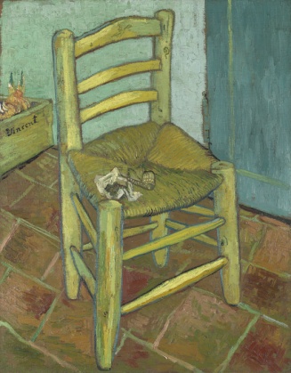
What is a complementary colour? The combination of the two other primaries (so here, red + yellow as complementary to blue). Or (the Newtonian version), the colour which, combined with its primary, makes white in coloured light, grey in coloured paint. Or, on the colour circle we have employed since the seventeenth century, the colour directly opposite its primary. Or, the colour of the after-image through closed eyes after staring at its primary. One might think that a primary and its complementary constitute a colour clash to be avoided. But many artists have realised that they may enhance one another when placed together – Delacroix, the Impressionists, van Gogh. According to John Gage, ‘throughout the nineteenth century complementary contrast was widely regarded as the most harmonious because it constituted a union of all three primary colours’. I suppose what goes for fashion advice simply doesn’t apply in the same way in aesthetic, and technical, decisions about painting. But my prejudice against orange, from my blue vantage point, apparently needs a bit more thought. A quick internet search turns up a range of companies, mostly in the design and technology industries, which capitalise on the combination of opposites: BlueOrange software consulting, Blue Orange Signs, Blueorange web technologies, Blueorange IT, Blue Orange Marketing, as well as a Blue Orange theatre (and a play, by Joe Penhall, called Blue/Orange, about race and mental illness, in which a patient maintains that oranges are blue). It seems that the clash is seen as productive and dynamic, just as the juxtaposition may be striking and beautiful in a work of art.
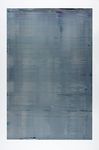
It may, on the other hand, merge into the grey that is the unavoidable blur of juxtaposition becoming total merger. Michel-Eugène Chevreul, director of dyeing at the Gobelins tapestry workshop in the mid-nineteenth century, promoted the use of complementary colours, but ‘warned that colours that mutually enhance each other can also cancel each other out if too intimately mixed: as an example, he wrote of threads in a tapestry that would appear merely grey if adjacent complementaries were too closely woven’. This became a problem in Seurat’s pointillist technique, where ‘uncalculated greyness’ surrounded the points of colour in some paintings. But here I want to put in a word for greyness, calculated or otherwise. In the field of art, the case is made by Gerhard Richter:
[Grey] makes no statement whatever… it evokes neither feelings nor associations; it is really neither visible nor invisible. Its inconspicuousness gives it the capacity to mediate, to make visible in a positively illusionistic way, like a photograph. To me, grey is the welcome and only possible equivalent for indifference, non-commitment, absence of opinion, absence of shape.
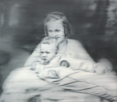
In his grisaille paintings, often blurry as well as monochrome, this ‘absence of opinion’ compels our own reflections, whether they are the series of works about the Baader-Meinhof group or the painting based on a photograph of an aunt of his, a schizophrenic killed in a euthanasia camp by the Nazis. There is a certain moral imperative in the way in which refusal of colour presents us with the image. The ‘indifference’ of the image evokes quite the opposite, I think, in the viewer, namely the insistence that we think for ourselves.
Now that I have navigated the threat of orange by merging it with blue, the grey I am left with is a colour with which I have a great affinity. (As it happens, though this is incidental, there are also three shades of grey in my CMB personal colour guide.) That ‘capacity to mediate’ which Richter alludes to is very compelling, and if we substitute ‘uncertainty’ for ‘indifference’, as I think quite legitimate, then I feel sure this describes an important life-long value of mine, though one I have only recently come to recognise, articulate and defend. My last book was called The Aesthetics of Uncertainty, and its project was to refuse certainties – especially uncritical, unconsidered certainties – in favour of an aesthetics (and an ethics) willing to start from a position of not-knowing. The open-minded negotiation of meaning and of value, in dialogue with others and with other points-of-view, is for me a particularly attractive feature of some contemporary political and theoretical trends. So if grey stands for that – one could say the avoidance of colour, the mediation of black and white keeping things fluid and not quite certain – it is an appropriate metaphor. But this is not about avoiding responsibility, nor is it a kind of postmodern relativism. Rather (to stay with the colour model) the image, confronting us in grey and perhaps also blurred, makes us think differently about its moral and political content, as well as its nature as painting and representation – a familiar avant-garde strategy. When I think about it, too, my academic life over more than thirty-five years was always somewhere between disciplines – sociology, cultural studies, art history, aesthetics – and institutionally nearly always in an interdisciplinary unit or project. A scholarly dilettantism (shared with many colleagues and friends over the years – that has been the trend in our corner of the humanities and the social sciences) which is another crucial kind of uncertainty. Grey Studies, maybe. As long as that is understood as a positive characterisation.
Primo Levi’s concept of the ‘grey zone’ of moral behaviour is not unrelated to this project of principled negotiation, though his subjects are acting out of what Lawrence Langer has called ‘choiceless choices’. These are the Kapos and Sonderkommandos of the Nazi concentration camps, many of them Jews and all of them prisoners, who operated as functionaries and thus, in a sense, as collaborators, helping to run the camps. He writes at length too about Chaim Rumkowski, elder of the ghetto of Lodz, who mediated between the Gestapo and the inhabitants of the ghetto. Levi identifies a hierarchy of collaboration, from ‘those whose concurrence in the guilt was minimal and for whom coercion was of the highest degree’ to those who took more powerful roles and, at the extreme, those who performed them willingly and with cruelty. But he refuses to condemn any of them. ‘How would each of us behave if driven by necessity and at the same time lured by seduction?’ he asks. This impossible situation constitutes the grey zone:
The harsher the oppression, the more widespread among the oppressed is the willingness, with all its infinite nuances and motivations, to collaborate: terror, ideological seduction, servile imitation of the victor, myopic desire for any power whatsoever, even though ridiculously circumscribed in space and time, cowardice, and, finally, lucid calculation aimed at eluding the imposed orders and order. All these motives, singly or combined, have come into play in the creation of this gray zone, whose components are bonded together by the wish to preserve and consolidate established privilege vis-à-vis those without privilege.
Levi included himself among those in the grey zone, exploring his residual feelings of guilt in an essay on shame. Still, he is less concerned to identify and judge levels of collaboration, than to insist on the recognition of circumstances of confusion and ambiguity. Scholars of the Holocaust have since shown how many ‘grey zone’ areas there were outside the camp and the ghetto – in industry, in the church, in the French detention centres, even in the area of post-war Holocaust restitution. The Holocaust is always the extreme case taken in discussions of ethics and morality, not always usefully if it is intended as a generic example. But I do think that the concept of the grey zone, somewhat downgraded from its stark and terrifying existence in Primo Levi’s experience, memory and testimony, is one we should retain, as an injunction against simplistic and unconsidered judgement.
I don’t think any of this is disloyal to blue. After all, as Philip Ball tells us, in the Classical literature the distinction between grey and blue was not at all clear. Blue was not then recognised as a colour in its own right, and was considered a colour related to black – ‘a kind of grey’.